This blog redesign was painfully long over due. No more giant Lisa header. Yay!! Thank you so much to my tap tap tap colleagues for whipping this up in a few days.
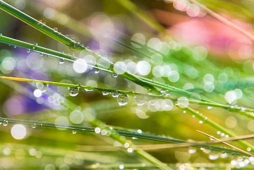
Designed by the incomparable Wolfgang Bartelme, who did all the amazing design work for Camera, both in-app and all the promo pages. He obviously used my love of bokeh as a theme and I couldn’t be more happy with this design.
WP Theme, coding and moral support by Scott Meinzer, who gave up hours of sleep and trips to the Cheescake factory to finish my blog.
I feel really inspired to start filling this blog with more photos, video and a lot more love than I’ve given it in the past few months. Hope you like it as much as I do!

Thomacintosh
July 2, 2010 at 4:37 AMJust, I like it!
Parkylondon
July 2, 2010 at 5:01 AMLooks great Lisa. Nice piece of work. Not being a programmer I’d like someone technically minded to explain what you used to get to this point. Is it all CSS or is it written in something cleverer?
Still, lovely look.
Unique Design
July 2, 2010 at 5:50 AMHallo Lisa!
For a great photographer as you are, your blog shouldn’t be different from how has been redesigned!
I really like the theme and the color scheme. Nice usage of the new CSS3 features as well.
Keep up with the great work! ;)
Marc
July 2, 2010 at 5:58 AMLove it! As you say, Lisa, this redesign was overdue, but it’s awesome. :D
Very modern, clean and easy on the eyes.
gergel
July 2, 2010 at 6:39 AMReally nice!
I would see comment this buttons on the main site to the posts. I miss it.
Mike Page
July 2, 2010 at 7:11 AMIt’s beeutiful! :)
Hakan Uzunoglu
July 2, 2010 at 7:34 AMit’s obvious that it resents both bartelme’s and your style.
cool, loved the css3 tricks.
there are some glitches though, Yanone Kaffeesatz doesn’t look perfect in chrome win7. (firefox renders this font much better)
by the way, there was one more re-design with a tiny header — before you switched back to old huge mostly design — what happened to it ?
Jan
July 2, 2010 at 9:37 AMLooks great! Really fresh and clean, love it.
Now fill it up! ;)
Georg Portenkirchner
July 2, 2010 at 12:50 PMReally very nice new design.
Jerry Knaus
July 2, 2010 at 12:52 PMMuch, much nicer!
John
July 2, 2010 at 3:24 PMI miss the giant Lisa header…… :( Ok, seriously though you have a nice, clean site. Very nice.
Paul Minshall
July 2, 2010 at 3:42 PMThe choice of the different blues is quite easy on the eyes. Love the “orbs”
in the header.
Asela de Saram
July 2, 2010 at 11:11 PMWooh… love what you done with the place. Who’s your decorator? Haha… just kidding.
Good use of the CSS3 and Google Fonts API. Nice and & neat too. Sincerely with you the best!
Joe
July 4, 2010 at 2:01 AMFresh and beautiful. Nice upgrade.
Tom
July 7, 2010 at 9:48 AMLooks fantastic
MarkT
July 7, 2010 at 12:55 PMSome reason, my comment never made it the first time.
Just wanted to let you know that the font rendering on Chrome for Windows with this new theme is not good at all. Looks very pixelated. Chrome for Mac,Firefox or Safari for either everything looks just fine.
Charles
July 11, 2010 at 3:56 PMGreat new design!
My only quibble is a lack of search. Because you have such useful tips and anecdotes for beginner photographers like myself, I often come here to look for things that I might want to try. So being able to search for “off-camera” flash or “portraits” is pretty valuable to me (and I’m sure to others as well).
As always, keep up the good work.
subcorpus
July 28, 2010 at 8:11 PMlooks very clean …
nice … :)
Ulf
July 29, 2010 at 11:06 AMNice work, I really like the new design.
Dave
July 29, 2010 at 1:37 PMI love the logotype font. Any idea which font face that is?
Mostly Lisa
July 30, 2010 at 3:07 AMIt’s Droid Sans: http://en.wikipedia.org/wiki/Droid_(font)
Anthony Ginepro
August 15, 2010 at 6:40 AMYour site looks really great on mobile, I was really surprised. Good work !
Anthony Lloyd
August 26, 2010 at 8:00 PMI like the ABOUT section in the right hand corner plus the simple design.
There is go flow of information unlike many tech blog that crowd stuff onto a page.
Following Mostly Lisa at Twitter