Twitter redesigned some stuff. Moved tabs to the side and opened up the design. Personally I like it. The best new ‘tweek’ is the ability to reply to a Direct Message just by clicking a small mail icon on the right-hand side of the message you’d like to reply to.

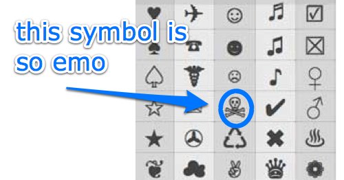
Also, you can spice up your tweets or express the complexity of your emotions with TwitterKeys by the guys at The Next Web, i.e. ❉ ❥ ♘. It’s nothing complicated, just a pop up browser bookmarket of a symbol library where you copy and paste little unicode symbols anywhere, like on Twitter, Facebook or right here, on your blog: ☃.
Or just like, double click & copy n paste these puppies below:

chris
September 18, 2008 at 8:41 PMಠ_ಠ
subcorpus
September 18, 2008 at 8:42 PMi was wondering how kevin rose and the tech guys i follow were doing it coupla days back …
now we know eh … hehe …
thanks for sharing …
testing now …
chris
September 18, 2008 at 10:42 PM@pasquale Features schmeatures. It sure looks pretty!
MhawSayar
September 19, 2008 at 3:34 AM☤☤☤☤☤ Thanks a lot Lisa! Very interesting symbols! ☤☤☤☤☤
Tyler
September 19, 2008 at 6:20 AMI’ve got mixed feelings about the new redesign ☢
Oh well, I use twitterific more than the website anyway.
Jason
September 19, 2008 at 8:36 AMI like the new layout as it is easy on the eyes and you don’t have to search for things ~ which is my number one pet peeve with websites.
Afif Tabish
September 19, 2008 at 10:27 AMI think its pretty badass.
Its better than the crapy new facebook which I dislike so much.
Georg Portenkirchner
September 19, 2008 at 12:10 PMI ♥ it!
steve garfield
September 20, 2008 at 7:26 PMFun! ♥
Boris
September 21, 2008 at 2:12 PM♥ you for mentioning and ☛ to TwitterKeys! Unfortunately not all characters from Character Pallette on Mac & Character Map on Windows work on all browsers. You can see that demonstrated in the first comment where all I see is weird unicode and other people only see a white cube: ಠ
TwitterKeys is a sub-selection of characters that seem to ✔ fine on all browsers and platforms.
The safer bet! ☺
chris
September 22, 2008 at 2:44 PM@Boris Whoops, sorry. That should look something like what you see at http://icu.tinsanity.net/. There’s more info at http://www.fileformat.info/info/unicode/char/0ca0/index.htm.
chris
September 22, 2008 at 6:12 PMWhoops. ;)
That was supposed to look like this. It’s a Unicode Character ‘KANNADA LETTER TTHA’ followed by an underscore and another ‘KANNADA LETTER TTHA’ to make a grumpy-looking smiley/emoticon/whatever you want to call it.
HvosT
October 23, 2008 at 3:07 PMMore TwitterKeys: http://hvost.org/?p=594
macpug
August 10, 2009 at 11:52 PMSort of related: if you’re using an iPhone and you’re one of the six people who don’t have emoji enabled, there’s a cool little webapp called Glyphboard (http://mrgan.com/gb/) that installs an icon on your phone and gives you a page or two of symbols that you can copy and paste into a message. Cheers ☮